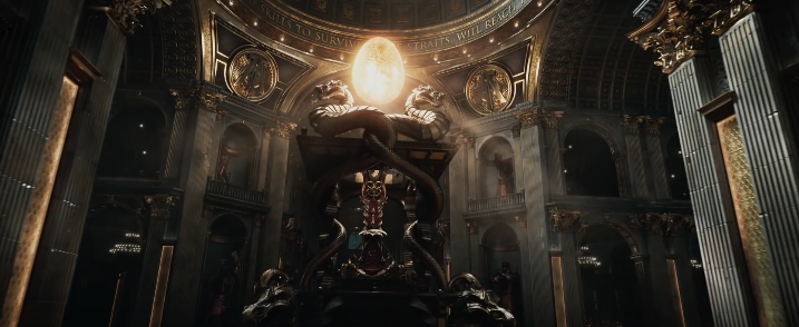
The latest trailer for the upcoming film Ready Player One features this image – which is clearly a dark riff on the Vatican:

Here’s the real-life original:

The latest trailer for the upcoming film Ready Player One features this image – which is clearly a dark riff on the Vatican:

Here’s the real-life original:

Part 1: One of my pet peeves is when people substitute an opening quotation mark for an apostrophe – for example, when they write the abbreviation for 1973 as ‘73 instead of ’73.
This is a phenomenon of the computer age; I don’t recall seeing it when I was growing up in the ’70s and ’80s, but I see it all the time now. The reason is that it’s a product of auto-correct; in most word-processing programs, if you try to type an apostrophe at the beginning of a word, auto-correct will assume you intended to type an opening quotation mark, and so will change it to an opening quotation mark, and you have to make a conscious effort to change it back.
But as a result, people’s brains have been warped to the point that nowadays, even when auto-correct isn’t involved (for example, when they’re hand-painting a sign), they still substitute an opening quotation mark for an apostrophe.

Goddamn reversed apostrophe
I think the most embarrassing (because most expensive and high-profile) example of the mistake that I’ve seen is in the 1973 posters of Billie Jean King and Bobby Riggs flashed up at the 0:26 and 0:42 marks this new movie trailer. It’s particularly ironic because it’s a mistake that wouldn’t have been made in 1973.
Part 2:
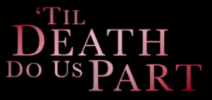
Well, that example didn’t wear the “most embarrassing (because most expensive and high-profile) example” crown for long. Right after I wrote the above, I came across a much worse example in the following trailer (at the 2:15 mark), which features a gigantic apostrophe fail in the very title of the goddamn movie:

Embarrassing trailer
Thankfully, this empire of incompetence does not extend everywhere. This poster for the movie was evidently made by people who grasp the difference between apostrophes and quotation marks:

Non-embarrassing poster
Unfortunately, there’s another poster ….

Embarrassing poster

Last weekend, at the Fox Theatre in Atlanta, I saw Love Never Dies (Andrew Lloyd Webber’s sequel to Phantom of the Opera) on its first North American tour. I enjoyed it, although the characterisations are wildly inconsistent (both within the show and between it and its predecessor).
They’ve revised the show a bit for its newest tour – though nothing as drastic as the total retooling between the UK and Australia productions. But, for example, the music for the song “The Beauty Underneath” has been completely rewritten. I like the new version; but I also miss the old version.
The set design is a bit different too – sort of a cross between Art Nouveau and “Pirates of the Caribbean” (the ride, not the movie).