Part 1: One of my pet peeves is when people substitute an opening quotation mark for an apostrophe – for example, when they write the abbreviation for 1973 as ‘73 instead of ’73.
This is a phenomenon of the computer age; I don’t recall seeing it when I was growing up in the ’70s and ’80s, but I see it all the time now. The reason is that it’s a product of auto-correct; in most word-processing programs, if you try to type an apostrophe at the beginning of a word, auto-correct will assume you intended to type an opening quotation mark, and so will change it to an opening quotation mark, and you have to make a conscious effort to change it back.
But as a result, people’s brains have been warped to the point that nowadays, even when auto-correct isn’t involved (for example, when they’re hand-painting a sign), they still substitute an opening quotation mark for an apostrophe.
Goddamn reversed apostrophe
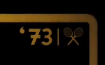
I think the most embarrassing (because most expensive and high-profile) example of the mistake that I’ve seen is in the 1973 posters of Billie Jean King and Bobby Riggs flashed up at the 0:26 and 0:42 marks this new movie trailer. It’s particularly ironic because it’s a mistake that wouldn’t have been made in 1973.
Part 2:
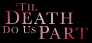
Well, that example didn’t wear the “most embarrassing (because most expensive and high-profile) example” crown for long. Right after I wrote the above, I came across a much worse example in the following trailer (at the 2:15 mark), which features a gigantic apostrophe fail in the very title of the goddamn movie:
Embarrassing trailer
Thankfully, this empire of incompetence does not extend everywhere. This poster for the movie was evidently made by people who grasp the difference between apostrophes and quotation marks:

Non-embarrassing poster
Unfortunately, there’s another poster ….

Embarrassing poster
Thank you Roderick for teaching me. I had been unaware of that distinction.
What you call a “quotation mark” has but a single, rather than a double, stroke. I am still fuzzy on the accepted usage, the places where one stroke should be used instead of two. Are you using a style manual as authority?
The ASCII character set (from early 7-bit days) seems to recognize no distinction. I wonder if this power of discrimination grew with more discriminating character sets (8 and 16 bit).
A few years ago I found and still love _Understanding Grammar_ by Paul Roberts (1954). It reports usage without getting holy about rules. The abuses we hate may show that acceptable usage is changing around us. But I feel proper when I hang onto the usage taught in my upbringing.
There is no generally accepted practice on when to use a single-quote mark as opposed to a double-quote mark. Instead there are a bunch of competing practices.
One common practice is to use single-quotes for quotations within quotations, e.g., “He said, ‘Oh no!'” But one sometimes sees the reverse practice: ‘He said, “Oh no!”‘
In philosophy, one often sees the convention that double-quotes are for quotations while single-quotes are for concepts. But it’s not universal.
But while the single-quote vs. double-quote distinction is ambiguous, the single-quote vs. apostrophe distinction isn’t.
At least in my experience, the distinction is transatlantic, with Brits typically using single quotation marks where Yanks would typically use doubles, and vice versa.
“Hit me up when someone says, ‘No, thanks!'” (US)
‘Hit me up when someone says, “No thanks!”‘ (UK)
I also see single quotation marks used to indicate something like “so-called” or to express irony, doubt, etc.
On “Apostrophe Fail”, Roderick’s original subject, I’ve done some more homework.
First, I recall that typewriters on which I was raised in the ’50s and ’60s offered only one single-stroke apostrophe-like character, and one double-stroke quotation mark. There was no distinction between right and left. And as I noted in my earlier comment, 7-bit ASCII also did not distinguish. That 7-bit history is preserved in the UTF-8 Basic Latin set which you can see listed in this webpage (assuming this interface allows me to insert a URL):
In your blog posting above, Roderick, I believe I am getting a right single quotation mark in each place where you intended an apostrophe. I see:
“growing up in the ’70s and ’80s”, instead of
“growing up in the ’70s and ’80s”.
Does the difference show up? I will not know till I post this and see what the intermediating software has done with my clean (but known only to me) truth.
Perhaps you intended to use right single quotation marks, as my search has found this assertion: “The single close quote character is also used in English as the apostrophe.”
Note that we are (or at least I am) writing here about three distinct single-stroke marks: right and left in addition to apostrophe. Typewriters of old offered only one for these three. And the keyboards on my two computers today offer only two for the three. But, for those who care enough, there are workarounds.
I do not detect a difference in this font.
Yes. The difference did not come through; apparently the intermediating software “auto-corrected” my characters which were different upon entry into all the same character. So I sent you email a few hours later (at 2:45 pm on Dec. 14). I believe the difference will show up in your email client. Perhaps I do not have your current email address, or my email got flagged as spam.
I can generate the three characters I am talking about with visible difference in HTML pages which I create, and in documents on my computer. Indeed, right here in this comment-entry field I can enter the three characters which appear different [‘’’] to me here now, when I enlarge the font display considerably. But I expect once again they will be homogenized before they are displayed publicly.
My email client erased the difference too. All the machines are in on the conspiracy.
Correction. You are right Roderick. It is in the font displayed and not in the digital character as communicated through the intermediating software.
I do a geek trick which you may already know. To view the HTML source code which generates a web page type Ctrl-u when the cursor is in a webpage. This works on my Windows computer in any of my three browsers, and might work on your system. In that HTML source I see that my digital-character differences are preserved.
What is happening with Richard’s apostrophes is that WordPress’s filters are converting them all to the same character. WP likes to display quotes using the HTML entity (a way of representing certain characters or groups of characters). You can also directly use the entity, or the numeric reference. I will demonstrate below:
’ ’
‘ ‘
' '
' '
The first two are entities, the third is numeric, and the last is also an entity. There are many sites that have lists of references that can be used, for instance this one.
Incidentally, check out this video of the Apostrophe Vigilante (conical hat tip to Irfan Khawaja):
https://www.facebook.com/bbcradiobristol/videos/1359545534102549/
Clearly my respect for property rights is keeping me from my true calling.
I consider myself to be at least quasi anarchist. But this kind of issue, for me, poses a significant challenge to the idea of a self-ordering society without hierarchy. There are so many things, from language to ethics, that we learn mainly by imitation. The ‘democratization’ of publishing that the web created has clearly demonstrated a potential danger of an absence of hierarchy. In past decades, most of the material that most people read was edited by someone who was relatively skilled and knowledgeable about writing and the language. If nothing else, it had to be typeset by someone who was bound to be above average in these areas. And so there was a quality filter built into the learn-by-imitation mechanism. If the average person did nothing more than assume that something unfamiliar was wrong they would be right far more often than they would be wrong. That heuristic no longer works in an environment free of hierarchy. The opposite is more likely to be true.
One could argue that a more methodical way of learning would naturally evolve in an environment free of hierarchy. But I’m very doubtful about that.
On the other hand, self-publishing allows me to keep my writing grammatical, whereas I’ve often had my words changed in ways that make them ungrammatical by fool editors in traditional publishing. So absence of hierarchy cuts both ways.
It may be one of those situations where the effect depends on where you sit in the distribution. If you’re a skilled writer you run the risk of being pulled down (oligopsony being changed to oligopoly, for example). But even a mediocre editor is likely to have well above average skill and knowledge. So the middle and lower parts of the distribution are likely to be pulled up.
Fare enuff.